
 ,
,


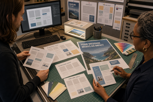
A flyer works only when someone can understand within a few seconds what they are looking at. A brochure can provide more explanation, but still needs a clear hierarchy. Start with the message and the context of use, not decoration.
Then come the practical choices: size, amount of text, image quality, margins, bleed, colour mode, paper and how the file can be edited again later.
Less than is usually written in the first version. Put the main purpose, who it is for, where or when it applies and how someone can continue first. Background information can move to a website or brochure.
When an image or colour area runs to the edge of the paper, the design extends slightly beyond the final trim size. That extra area is the bleed and prevents white edges caused by small cutting deviations.
That depends on the final size and printing process. An image that looks sharp on a phone may appear pixelated at A3. Judge the effective resolution at the actual size used and avoid unnecessarily enlarging a small source image.
Yes. Visual arts and Digital can connect to design and proof output. When the presentation also needs a frame, holder or other object, Woodworking, Metalworking or 3D printing may become relevant.
Copyright © 2026, ASK-Solutions


