
 ,
,


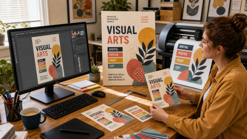
A visual identity is more than a logo. Colour, typography, whitespace, images, tone of voice and recurring layout choices together determine whether people recognise and understand something.
It is important that the choices do not exist only in one final file. Source files, colour definitions and simple agreements make it possible to adapt a flyer, website image or sign later without having to recreate everything.
Keep the logo in a scalable format where possible, record fonts or alternatives, colour values and a few basic usage rules. Also record which files are intended for screens, print and cutting.
RGB describes light on screens; CMYK is a printing process; Pantone and RAL are reference systems for specific physical colours. The same “colour” can therefore look visibly different on a monitor, printer, vinyl, plastic and paint.
Inkscape can be suitable for vector work, GIMP for image editing and Scribus or LibreOffice for layout depending on the document. The important point is that source files remain editable rather than being kept only as flattened JPEG or PDF files.
Yes. At Visual arts and Digital, for example, a design can be compared on screen and as a physical test piece. For holders, lettering or components, 3D printing may also be relevant.
Copyright © 2026, ASK-Solutions


